

AP Human Geography
ON THE ROAD
Helvetica Light is an easy to read font, with tall and narrow letters, that works well on almost every site.
World Distribution

On a map, specifically a dot map, you can see where areas are clustered, and where they aren't. On a local map, you can see individual farms in a sparsely rural area, whereas, on a global scale, if you were to look at maybe, California, and New York, you would notice the numerous amounts of dots in those areas, because they are both very popular, and heavily populated as shown in the map to the left. Each dot represents 100,000 people.
Population can be studied through population densities. Two major ways geographers look at population and calculate population is through arithmetic density, and physiological density. To calculate arithmetic density you divide the total number of people by the area of the land. For example, Los Banos has a population of 36,822, with an area of 10.117, so it's density is about 3,639/sq mi. To calculate physiological denisty you divide the total number of people by the area of arable land. Again, we will take Los Banos's population of 36,822 and now divide it by 9.993 its arable land, so it's density is about 3,684/sq mi.
Growing Population
To calculate population through the natural growth rate you need the birth rate and death rate of that country, using this equation as follwing:
Birth Rate per 1000 - Death Rate per 1000 = RNI x 1000
Using Australia, we know the birth rate is 13 per 1000, and death rate is 6 per 1000. 13 divided by 1000 is 0.013, and 6 divided by 1000 is 0.006. Next, you'll the subrtact the two and you'll get 0.007. You multiply this by 1000, because a percentage is out of 100. So the RNI is .7%. Now to figure out how this will determine how much the population grows through this, we can multiply this Australia's population of about 23 million to .7%. We can suggest each year Australia grows about 1.6 million.
Crude birth rate is the number of births in a country per 1000 people. Crude death rate is the number of deaths in a country per 1000 people. Brazil's CBR is 15 per 1000, so basically 15 births. As for death Brazil's CDR is 6 per 1000, so basically 6 deaths. This is all over a time span of one-year.
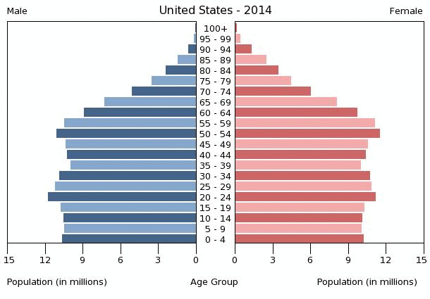
A population pyramid can help geographers understand a country very quickly by a couple of observations. These pyramids are split between females and males and shows their age groups of each gender. In most pyramids it is known women tend to live longer than men. However, lets look at how different a developed country looks from a developing country. Looking to the right you have Kenya's and United States population pyramids of 2014. Kenya is developing for different reasons, and the pyramid shows this. Kenya's growth rate is slow because of the following reasons: life expectancy gets extremely small and low as a person gets older, so there basically isn't any oldies holding up for the population and the amount of children being born is very high. Also, you will notice the shape of Kenya's pyramid shows one of a curved triangle, getting closer to the top, you don't want this. you want a more even almost like rectangle shape to achieve a devleoped name. United States is a developed country, thus that is why the pyramid has more of a box figure. The life expectency is higher than most, population growth is slower because of longer life, and infant mortality is low.


Varying Growth
Understanding the DTM we should know that in the world most countries reside in Stages 1-4. Countries in Stage 1 are only a few, because most countries have moved from a Pre-Industrial society. Death and birth are both high, and population is caused to be slow or stable in this case. Countries in Stage 2 include Egypt, Kenya, and India. These countries are very young in age, with the high birth rates, however death rates drop rapidly. This is for the innovation in medicine and care. Population also begins to increase quickly. Countries in Stage 3 include countries like Brazil. Since medicine and care is more in swing the death rate is at a slower rate, however birth rates begin to drop. Children aren't needed as much anymore, so birth rates drop. Population continues to grow at a slower rate in these countries. Countries in Stage 4 include countries like the U.S., Japan, and France. Birth and death rates both drop but at a much slower rate. Population has begin to stablize.
Two ways known to reduce birth rates in some countries were through the increase in education, and government control. In countries where education was presented, many women who had the opportunity to recieve education would likely not have kids at a young age, whereas in not educated countries the age of moms is very low, and the amount of kids given birth are high. Thus, the smarter the woman is, the less likely they will have kids at an early age/have many kids, or even just choose not to have any at all. With government control, we can see this in China with the One-Child Policy. China's birth rate was extremely high, so the government implented that families could only have one child, if more were around, they could get arrested or in major trouble. This helped slowed the birth rate very extremely. You can see this in the graph to the right on how fast birth rates dropped.
Malthus's theory states that while population growth would grow at a geometric rate supplies will grow arithmetically, which would lead to global chaos. Basically, because while population doubling and tripling at a fast rate, and food production isn't incresing in that way also, it would lead to poverty, disease, war, crime, misery, and starvation. To understand this better a visual is provided to the right.
The 5th stage on a DTM is not very popular to many countries, for many are in Stage 3 and 4, however there are some countries in that stage like Germany. Birth rates are dropping below death rates. Death rates are reaching above birth rates, however population is continuing to grow.


